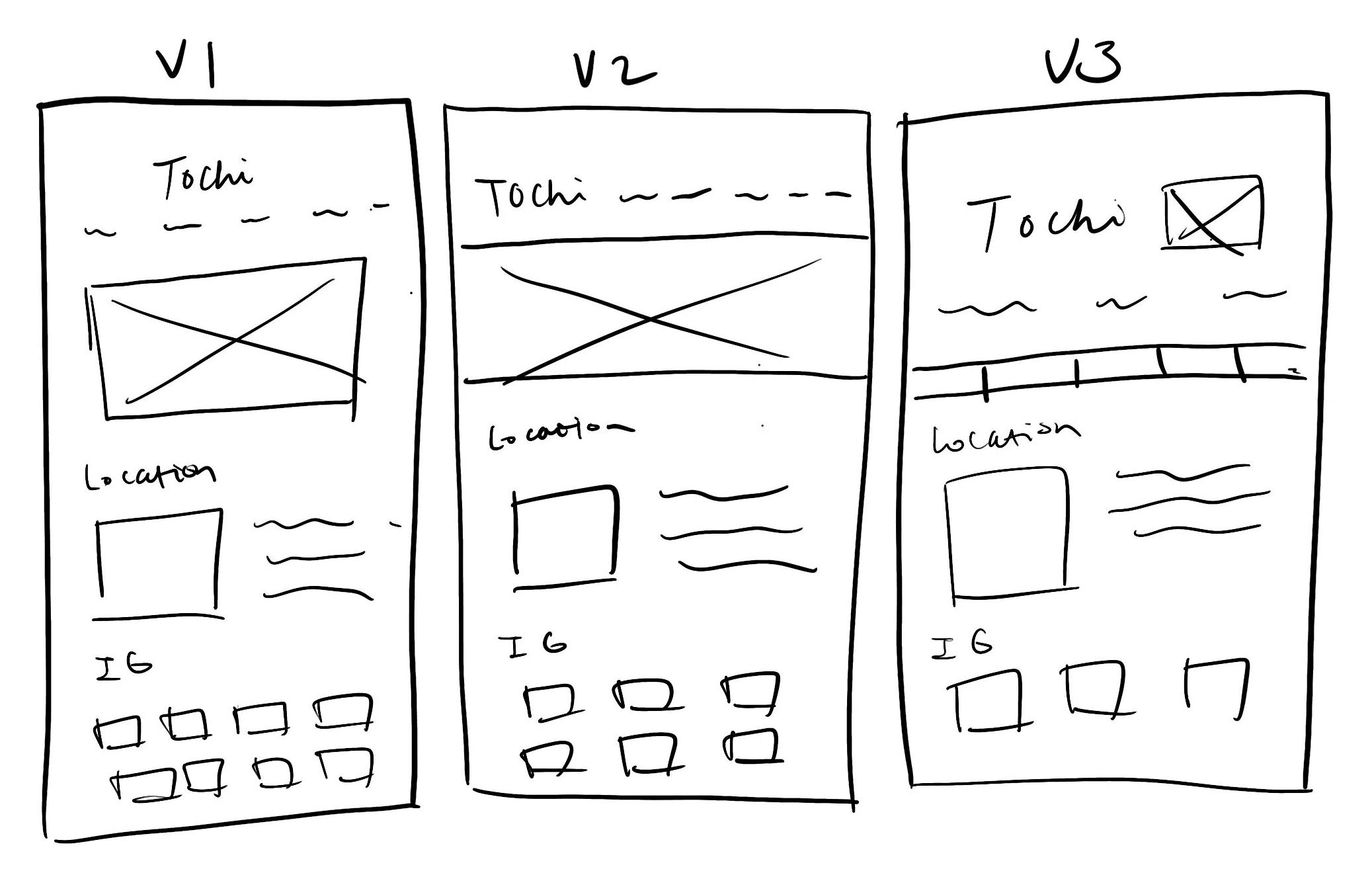

After exploring several iterations of landing page designs through sketching, I ultimately settled on Version 2 as it emerged as the layout commonly favored by bakery websites.
Sketch
Having a clear grasp of the website's architecture, I embarked on crafting initial sketches and low-fidelity wireframes. Mindfully incorporating insights from the user persona, site map, and user flow, I designed with Tiffany's objectives, specifically centering on her goals of ordering multiple donuts and seamless checkout. Grounded in user interview revelations, I iteratively refined the design flow to harmonize with my key discoveries, ensuring an optimized user experience aligned with user needs.
3. Design 🎨
User Persona
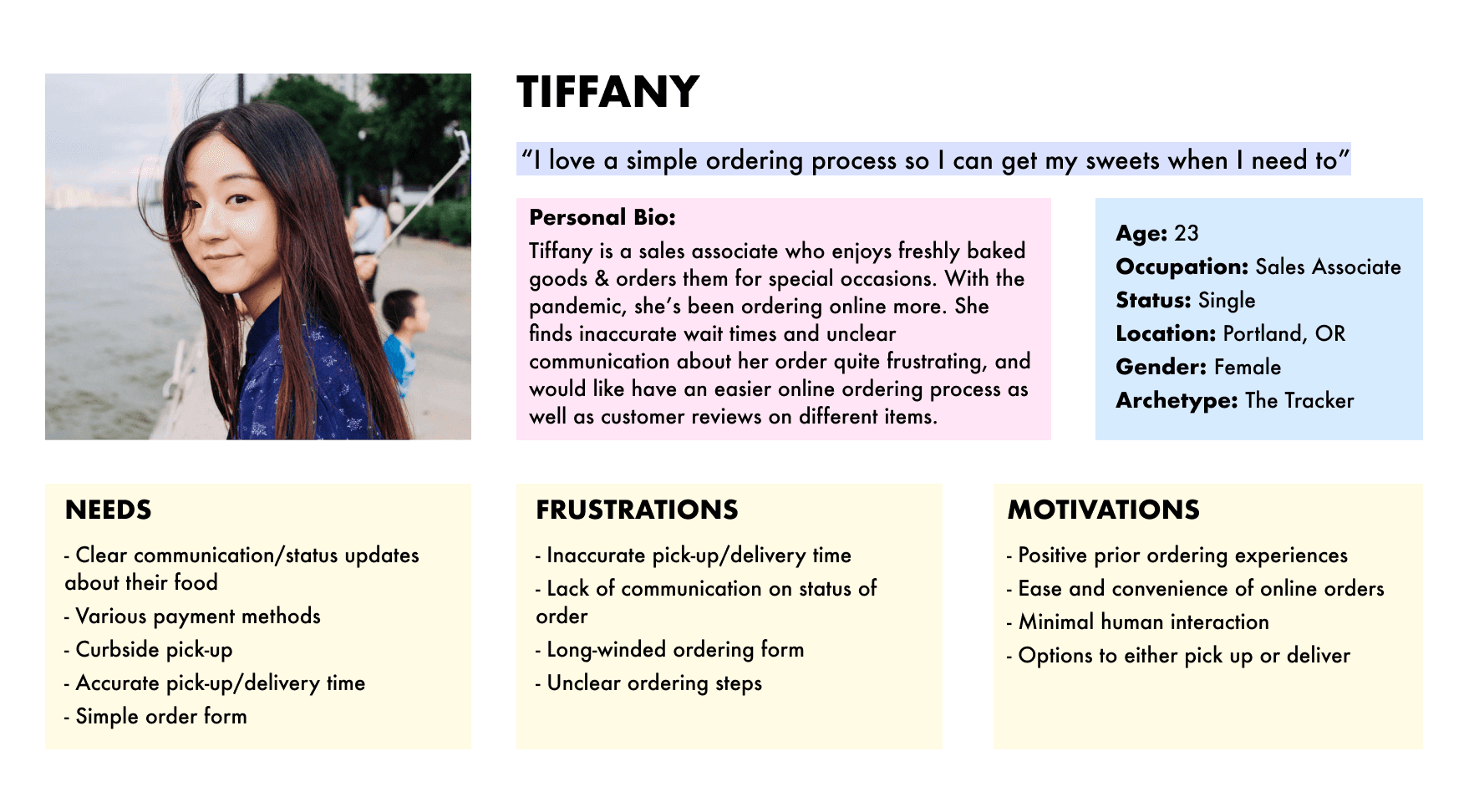
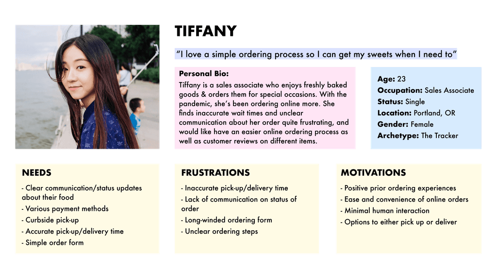
Meet Tiffany, our user persona crafted from insightful research. As a graduate student navigating her busy schedule, Tiffany frequently relies on online food ordering to satisfy her cravings.
I kept Tiffany in mind while designing the site.
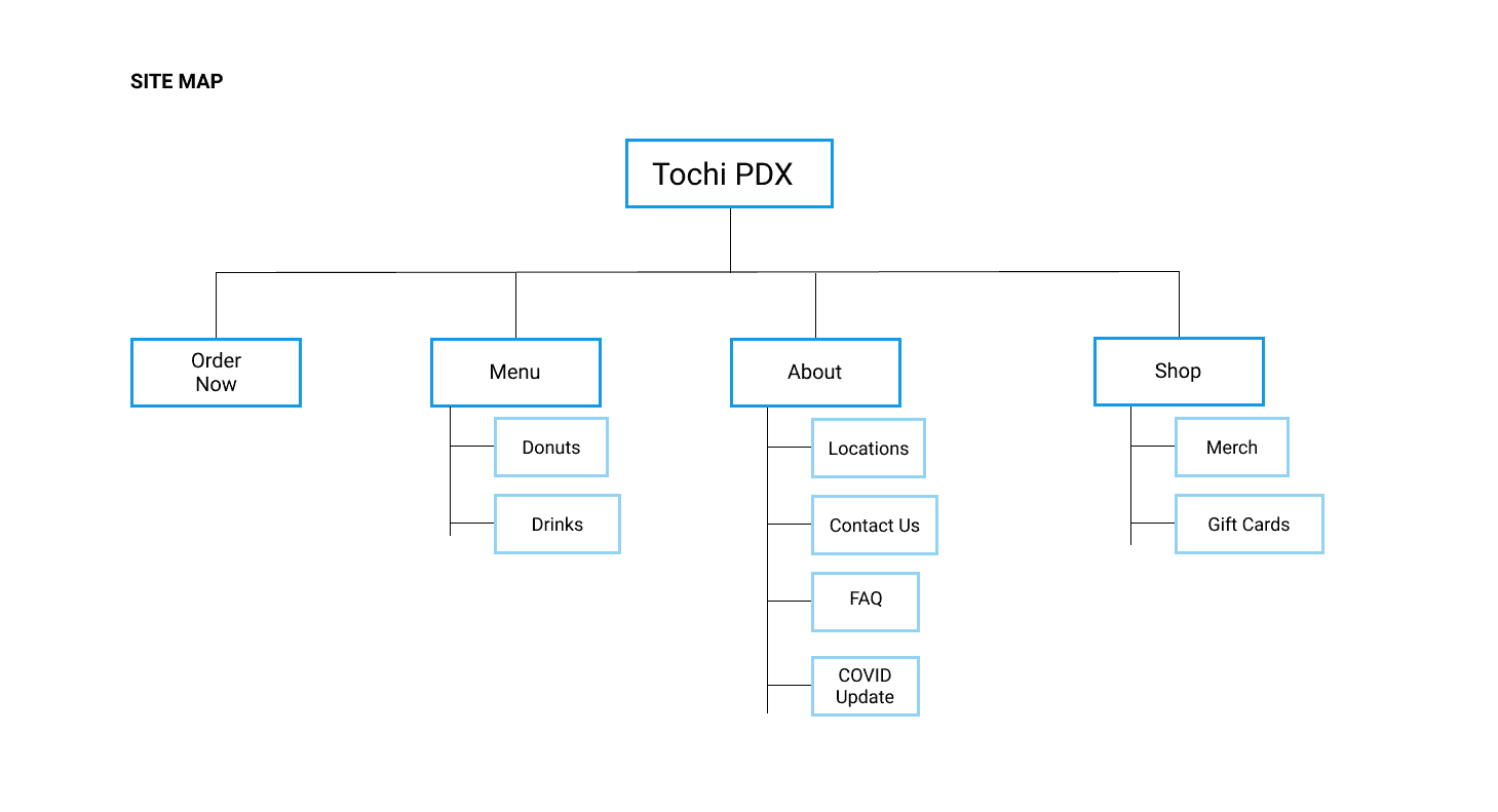
I initiated a comprehensive card sort exercise to organize the website's layout, delving into users' instincts in organizing information while ordering food. Leveraging insights learned, I crafted a site map and a potential user flow, ensuring a seamless navigation experience for our audience.
2. Define 💡

Information Architecture

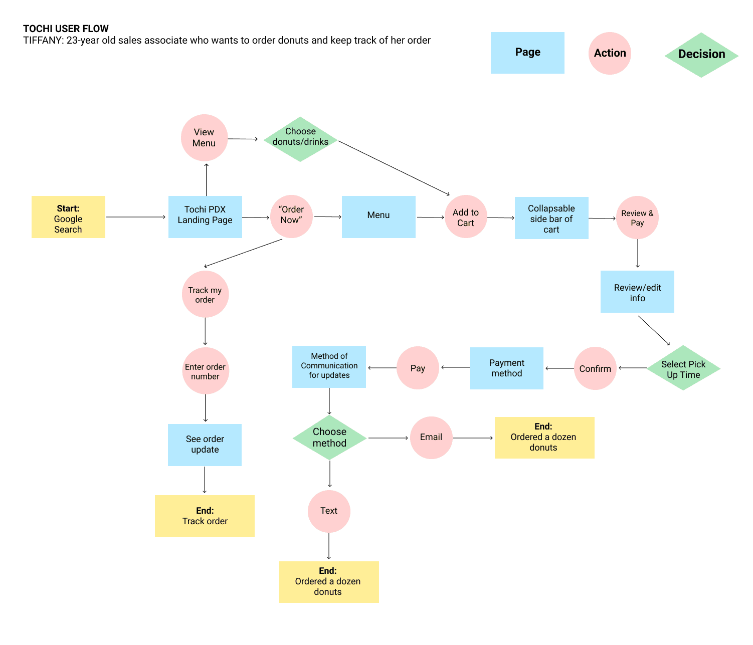

Utilizing a user flow analysis, I mapped out diverse pathways for users to accomplish various tasks on the platform. Throughout this process, I adopted Tiffany's perspective, envisioning how she would navigate the site to achieve distinct objectives. By crafting this user flow, I gained invaluable insights into potential user behaviors and uncovered multiple avenues for task completion, ultimately informing a more streamlined and efficient design structure.
User Flow
How might we craft a website experience that optimizes the food ordering journey, prioritizing seamless efficiency and respecting the time of our customers?
I conducted three 1:1 interviews with young professionals to learn more about their motivations, needs, and pain points while ordering food online.
All participants value their time.
All participants order online more now due to COVID-19.
All participants prefer to choose their of donut flavors and payment methods.
Two participants mentioned they would like live updates about their order.
🔑 Key Takeaways:
User Interviews


The Challenge ✨
Solution ✔
As a new local business, Tochi PDX aims to streamline the ordering process for its customers. Presently lacking an online ordering system, the objective is to develop an intuitive digital platform that ensures a seamless and efficient experience for customers, enabling them to place orders for food and beverages at their convenience.
Create a fresh and clean responsive e-commerce website that allows users to order donuts and drinks seamlessly.
· designlab project ·
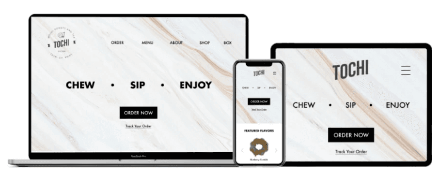
Tochi PDX is a new bakery focused on the popularized mochi donuts and bubble tea drink. Being a new establishment, their online presence is currently limited to Instagram. We see this as an opportunity to design a responsive website for future customers to order baked goods and drinks with ease and convenience.
view case study ↓
role
project timeline
tools
deliverables
3 weeks
Competitive Research
Journey Maps
High & Low Fidelity Wireframes
High Fidelity Prototype
Optimal Sort
Figma
UX Research
UX/UI Designer
project overview


Tochi PDX is a new bakery focused on the popularized mochi donuts and bubble tea drink. Being a new establishment, their online presence is currently limited to Instagram. We see this as an opportunity to design a responsive website for future customers to order baked goods and drinks with ease and convenience.
Role
UX/UI Designer
Tools
Deliverables
Project Overview
Project Timeline
3 weeks
Competitive Research
Journey Maps
High & Low Fidelity Wireframes
High Fidelity Prototype
Reflections 💭
In my second website design project, I delved into both the business and user objectives, gaining invaluable insights. Recognizing the significance of a streamlined checkout process for both customers and the business, I focused on crafting an efficient system. This endeavor shed light on the complexities of food ordering, emphasizing the importance of seamless ordering, tracking, and timely delivery for users.
If I had more time, I would deepen my research, conduct further iterations, and gather more user feedback. This would involve exploring direct competitors more comprehensively and refining the design based on a richer understanding of user preferences. Such thoroughness would enable me to fashion an optimal website experience tailored to the needs of both the business and its customers.
Reflections 💭
Prototype
4. Test 📝
I designed and developed a Figma prototype tailored to address key user objectives within the context of ordering from Tochi PDX. The prototype seamlessly guides users through three essential tasks:
These tasks were crafted based on insights from user persona development, comprehensive user flow analysis, and in-depth user interviews. They encapsulate the primary objectives users typically pursue when engaging with food ordering platforms, ensuring an optimized and user-centric experience.
#1: Ordering Mochi Donuts
Imagine craving three Blueberry Crumble and three Crème Brûlée mochi donuts. How would you navigate the platform to place your order?
#2: Order Tracking
You placed an order earlier today and want to track its progress. How would you locate and track your order status?
#3: Exploring the Menu
If you're unfamiliar with Tochi PDX and want to explore its menu, where would you turn to discover it?
Successes 👍
Next Steps 👣
All participants thought that the third task was simple.
All participants thought the overall flow of the website was easy to navigate.
All participants felt that the ordering system was easy to use, averaging 4.5/5.
Based on user testing:
Improve cart placement- Easier for users to navigate.
🍩 Order Donuts Here! (Final Prototype)
The Challenge ✨
Solution ✔
As a new local business, Tochi PDX aims to streamline the ordering process for its customers. Presently lacking an online ordering system, the objective is to develop an intuitive digital platform that ensures a seamless and efficient experience for customers, enabling them to place orders for food and beverages at their convenience.
Create a fresh and clean responsive e-commerce website that allows users to order donuts and drinks seamlessly.
How might we craft a website experience that optimizes the food ordering journey, prioritizing seamless efficiency and respecting the time of our customers?
Let’s start with some research!
User Interviews
Competitive Analysis
Research 🔍
During the research phase, I gained valuable insights into user behavior, understanding their decision-making processes and uncovering their needs and pain points. Utilizing data from competitive analysis, secondary research, and user interviews, I developed a comprehensive user persona to guide our design decisions.
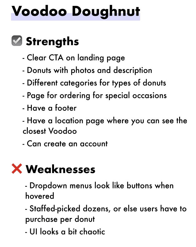
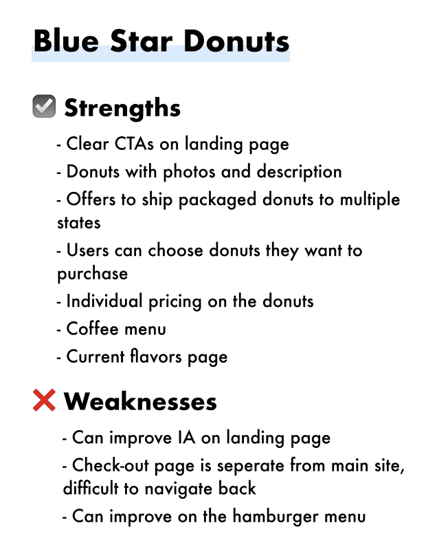
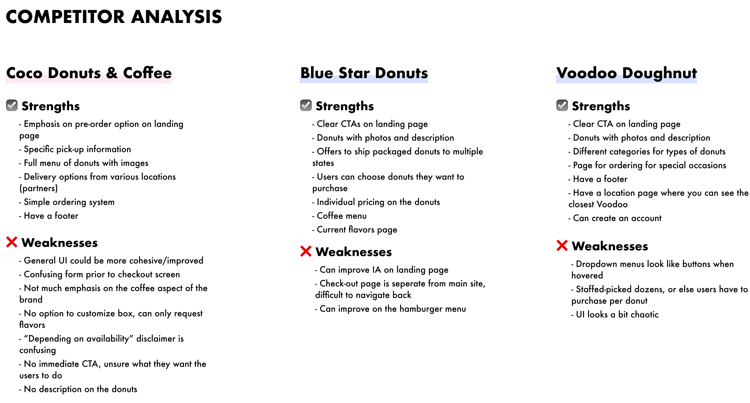
I focused on indirect competitors offering traditional donuts, as well as specific establishments like Coco Donuts and Coffee, which also offer mochi donuts. This research provided important context for our project and helped us better understand the market landscape.
🔑 Key Takeaways:
Ordering /check-out opens to a separate screen.
No immediate CTAs.
Difficulty customizing donuts.
I conducted three 1:1 interviews with young professionals to learn more about their motivations, needs, and pain points while ordering food online.
All participants value their time.
All participants order online more now due to COVID-19.
All participants prefer to choose their of donut flavors and payment methods.
Two participants mentioned they would like live updates about their order.
🔑 Key Takeaways:
User Flow
Information Architecture
User Persona
2. Define 💡
Meet Tiffany, our user persona crafted from insightful research. As a graduate student navigating her busy schedule, Tiffany frequently relies on online food ordering to satisfy her cravings.
I kept Tiffany in mind while designing the site.
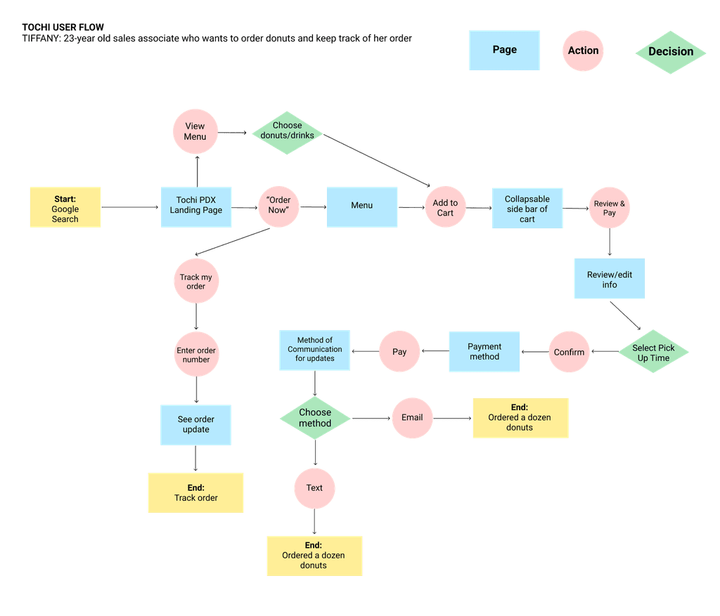
Utilizing a user flow analysis, I mapped out diverse pathways for users to accomplish various tasks on the platform. Throughout this process, I adopted Tiffany's perspective, envisioning how she would navigate the site to achieve distinct objectives. By crafting this user flow, I gained invaluable insights into potential user behaviors and uncovered multiple avenues for task completion, ultimately informing a more streamlined and efficient design structure.
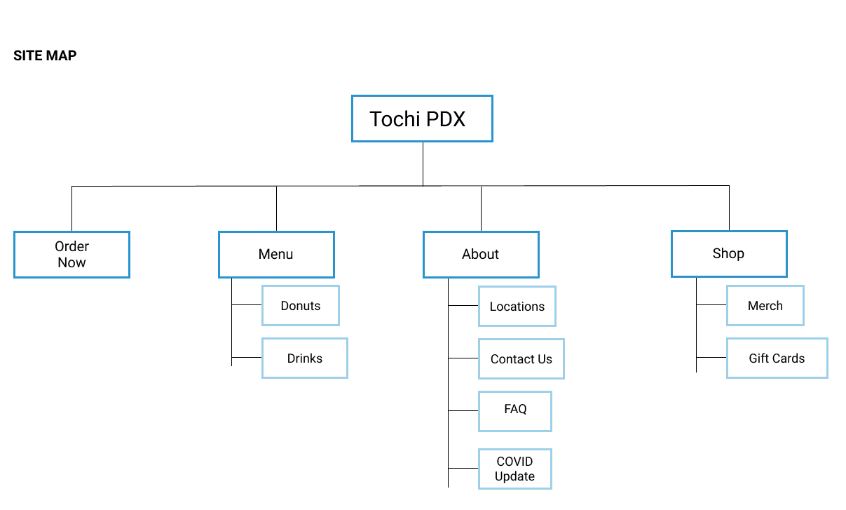
I initiated a comprehensive card sort exercise to organize the website's layout, delving into users' instincts in organizing information while ordering food. Leveraging insights learned, I crafted a site map and a potential user flow, ensuring a seamless navigation experience for our audience.

Low-Fidelity Wireframes
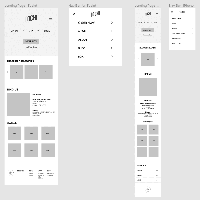
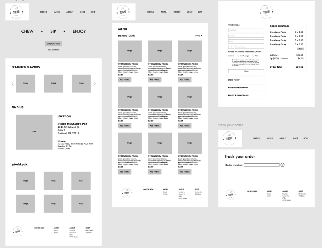
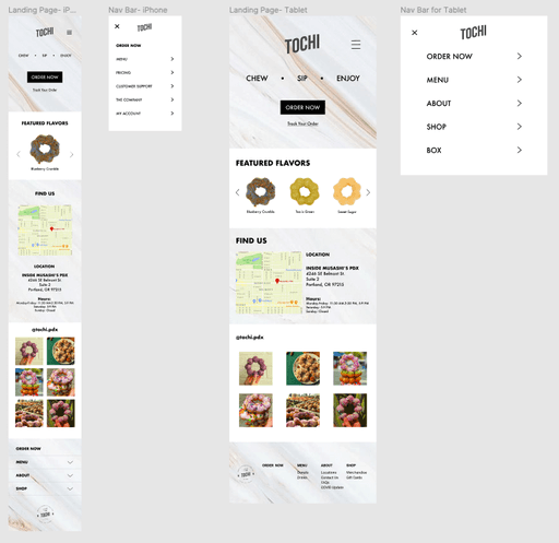
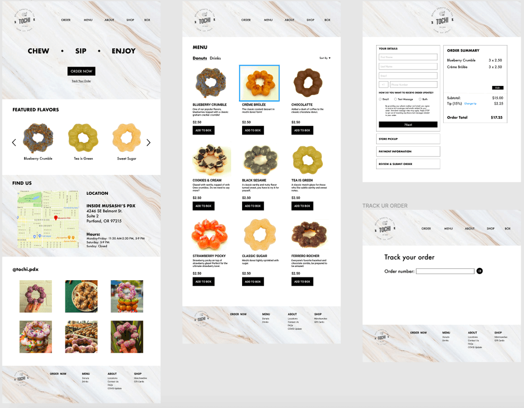
Drawing inspiration from my sketches, I translated key elements into low-fidelity wireframes encompassing the homepage, menu, order, and tracking screens tailored for desktop users. Additionally, I crafted responsive versions of the homepage catering to tablet and mobile devices, ensuring a seamless user experience across various screen sizes.
Sketches
3. Design 🎨
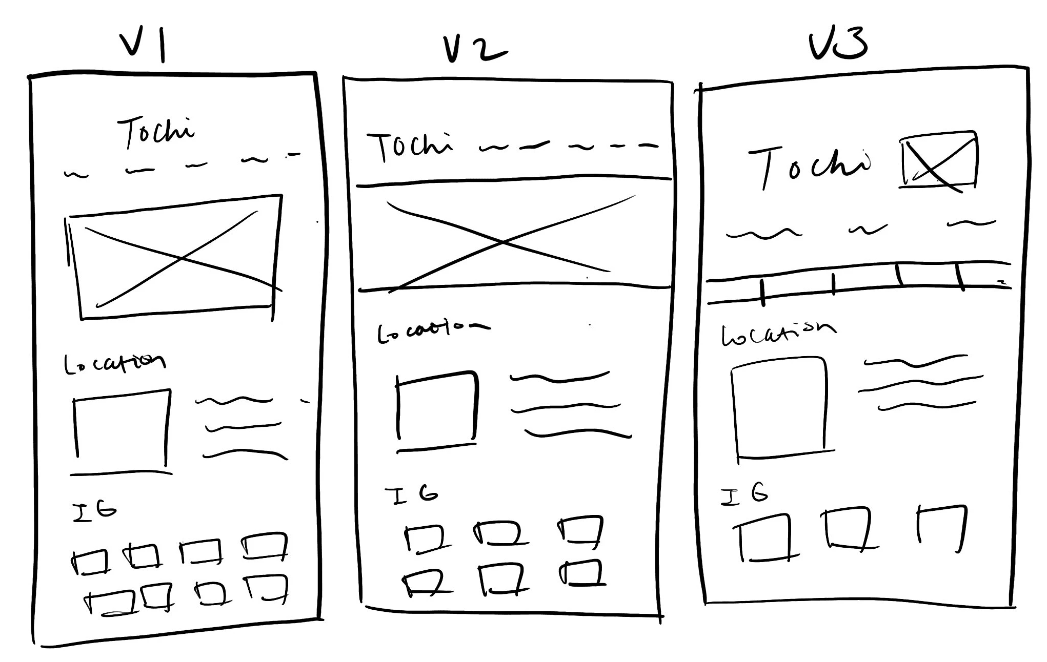
Having a clear grasp of the website's architecture, I embarked on crafting initial sketches and low-fidelity wireframes. Mindfully incorporating insights from the user persona, site map, and user flow, I designed with Tiffany's objectives, specifically centering on her goals of ordering multiple donuts and seamless checkout. Grounded in user interview revelations, I iteratively refined the design flow to harmonize with my key discoveries, ensuring an optimized user experience aligned with user needs.
After exploring several iterations of landing page designs through sketching, I ultimately settled on Version 2 as it emerged as the layout commonly favored by bakery websites.
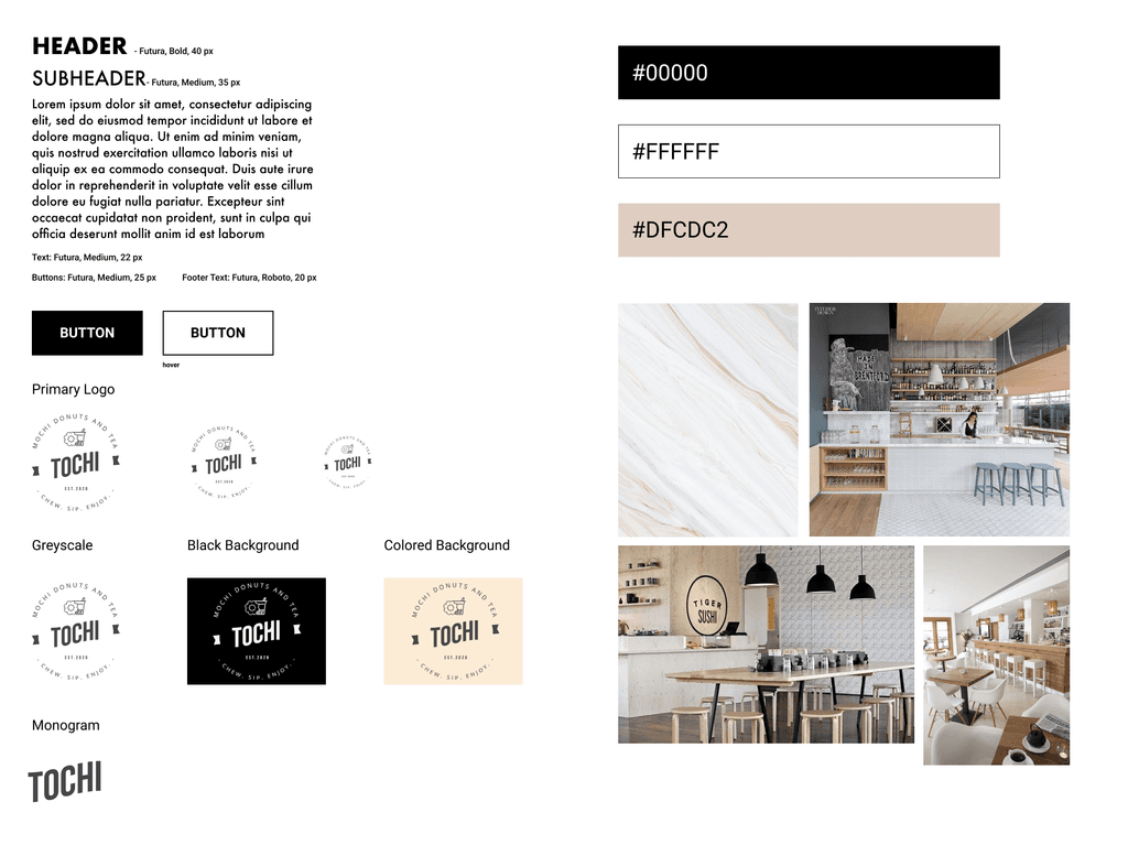
Guided by the business's preference for sleek aesthetic featuring marble elements, I took charge of defining the color palette and selecting appropriate typefaces to complement the provided black and white logo. This allowed me the creative freedom to conceptualize and craft the overall visual identity of the website in alignment with the client's vision.
I created a style tile for the website. To keep the page fresh and modern, I used a marble background for the hero on the landing page and a san serif typeface called Futura.
Branding
Combining my low-fidelity wireframes and style tile, I created a high-fidelity wireframe of the homepage for the desktop.
High-Fidelity Wireframes
Optimal Sort
Figma
UX Research


Let’s start with some research!
Research 🔍
During the research phase, I gained valuable insights into user behavior, understanding their decision-making processes and uncovering their needs and pain points. Utilizing data from competitive analysis, secondary research, and user interviews, I developed a comprehensive user persona to guide our design decisions.

Competitive Analysis
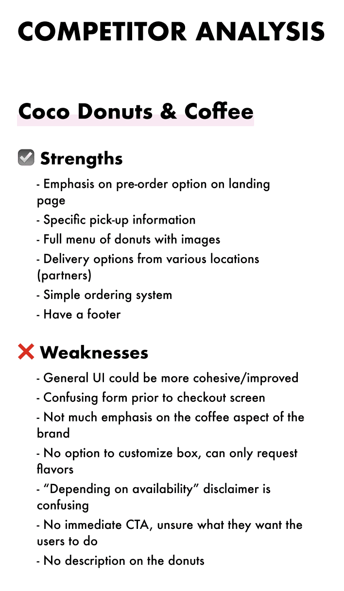
I focused on indirect competitors offering traditional donuts, as well as specific establishments like Coco Donuts and Coffee, which also offer mochi donuts. This research provided important context for our project and helped us better understand the market landscape.
🔑 Key Takeaways:
Ordering /check-out opens to a separate screen.
No immediate CTAs.
Difficulty customizing donuts.
Drawing inspiration from my sketches, I translated key elements into low-fidelity wireframes encompassing the homepage, menu, order, and tracking screens tailored for desktop users. Additionally, I crafted responsive versions of the homepage catering to tablet and mobile devices, ensuring a seamless user experience across various screen sizes.
Low-Fidelity Wireframes


