view case study ↓
· professional project ·
· professional project ·
project overview
Project Overview
role
Role
project timeline
Project Timeline
tools
Tools
deliverables
Deliverables
At Kohler, we emphasize self-service and aim to empower customers to find answers to their questions on our e-commerce site, kohler.com. While the current chat connects users with live agents instantly, implementing an automated chatbot will further enable customers to find answers independently, freeing up our agents for complex issues and delivering efficient support.
At Kohler, we emphasize self-service and aim to empower customers to find answers to their questions on our e-commerce site, kohler.com. While the current chat connects users with live agents instantly, implementing an automated chatbot will further enable customers to find answers independently, freeing up our agents for complex issues and delivering efficient support.
Feb ‘22 to Aug ‘22
Feb ‘22 to Aug ‘22
Competitive Analysis
Journey Maps
High & Low Fidelity Wireframes
Prototype
Competitive Analysis
Journey Maps
High & Low Fidelity Wireframes
Prototype
UX Research
Sketch
Miro
Useberry
Salesforce Einstein
UX Research
Sketch
Miro
Useberry
Salesforce Einstein
Associate UX Designer
Associate UX Designer
K
K
Here are some popular topics I can help you with. Type menu if you need to start over.
Here are some popular topics I can help you with. Type menu if you need to start over.
Hi! My name is Grace, your virtual assistant.


· professional project ·


K
Here are some popular topics I can help you with. Type menu if you need to start over.
Hi! My name is Grace, your virtual assistant.
Project Overview
At Kohler, we emphasize self-service and aim to empower customers to find answers to their questions on our e-commerce site, kohler.com. While the current chat connects users with live agents instantly, implementing an automated chatbot will further enable customers to find answers independently, freeing up our agents for complex issues and delivering efficient support.
Role
Associate UX Designer
Project Timeline
Feb ‘22 to Aug ‘22
Tools
UX Research
Sketch
Miro
Useberry
Salesforce Einstein
Deliverables
Competitive Analysis
Journey Maps
High & Low Fidelity Wireframes
Prototype
The Challenge ✨
The Challenge ✨
The Challenge ✨
Solution ✔
Solution ✔
Solution ✔
The challenge lies in the customer experience on kohler.com, where many resources are available but limited visibility causes users to navigate multiple pages, resulting in frustration. The current customer care team faces difficulties handling rising query volumes, leading to delays and dissatisfaction.
The challenge lies in the customer experience on kohler.com, where many resources are available but limited visibility causes users to navigate multiple pages, resulting in frustration. The current customer care team faces difficulties handling rising query volumes, leading to delays and dissatisfaction.
this leads us to ask…
this leads us to ask…
How might we enhance the efficiency of user support and satisfaction, ensure timely responses, encourage self-guided help and enable human agents to focus on more complex issues?
How might we enhance the efficiency of user support and satisfaction, ensure timely responses, encourage self-guided help and enable human agents to focus on more complex issues?
To address these issues, there is a need for an automated solution such as a chatbot that can efficiently handle routine queries, enabling human agents to focus on complex issues and enhancing overall customer support efficiency and satisfaction.
To address these issues, there is a need for an automated solution such as a chatbot that can efficiently handle routine queries, enabling human agents to focus on complex issues and enhancing overall customer support efficiency and satisfaction.
The challenge lies in the customer experience on kohler.com, where many resources are available but limited visibility causes users to navigate multiple pages, resulting in frustration. The current customer care team faces difficulties handling rising query volumes, leading to delays and dissatisfaction.
this leads us to ask…
How might we enhance the efficiency of user support and satisfaction, ensure timely responses, encourage self-guided help and enable human agents to focus on more complex issues?
To address these issues, there is a need for an automated solution such as a chatbot that can efficiently handle routine queries, enabling human agents to focus on complex issues and enhancing overall customer support efficiency and satisfaction.
Research 🔍
Research 🔍
Research 🔍
Initiating a discovery meeting, I collaborated with stakeholders and the customer care center manager to identify key chatbot issues. We categorized concerns into six areas: Order Status, Find Parts, Warranty, Care & Cleaning, Product Registration, and Product Identification.
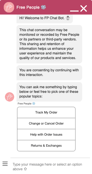
Following that, I completed a competitive analysis, engaging with diverse chatbots across various websites. Urban Outfitters and Free People, leveraging Salesforce Einstein, were purposefully selected to gather insights into pre-chat forms and interactive chat components. This strategic approach ensures an in-depth understanding of industry best practices and user expectations, precisely informing our chatbot implementation.
Our journey begins with a bit of research!
Our journey begins with a bit of research!
Our journey begins with a bit of research!
Initiating a discovery meeting, I collaborated with stakeholders and the customer care center manager to identify key chatbot issues. We categorized concerns into six areas: Order Status, Find Parts, Warranty, Care & Cleaning, Product Registration, and Product Identification.
Following that, I completed a competitive analysis, engaging with diverse chatbots across various websites. Urban Outfitters and Free People, leveraging Salesforce Einstein, were purposefully selected to gather insights into pre-chat forms and interactive chat components. This strategic approach ensures an in-depth understanding of industry best practices and user expectations, precisely informing our chatbot implementation.
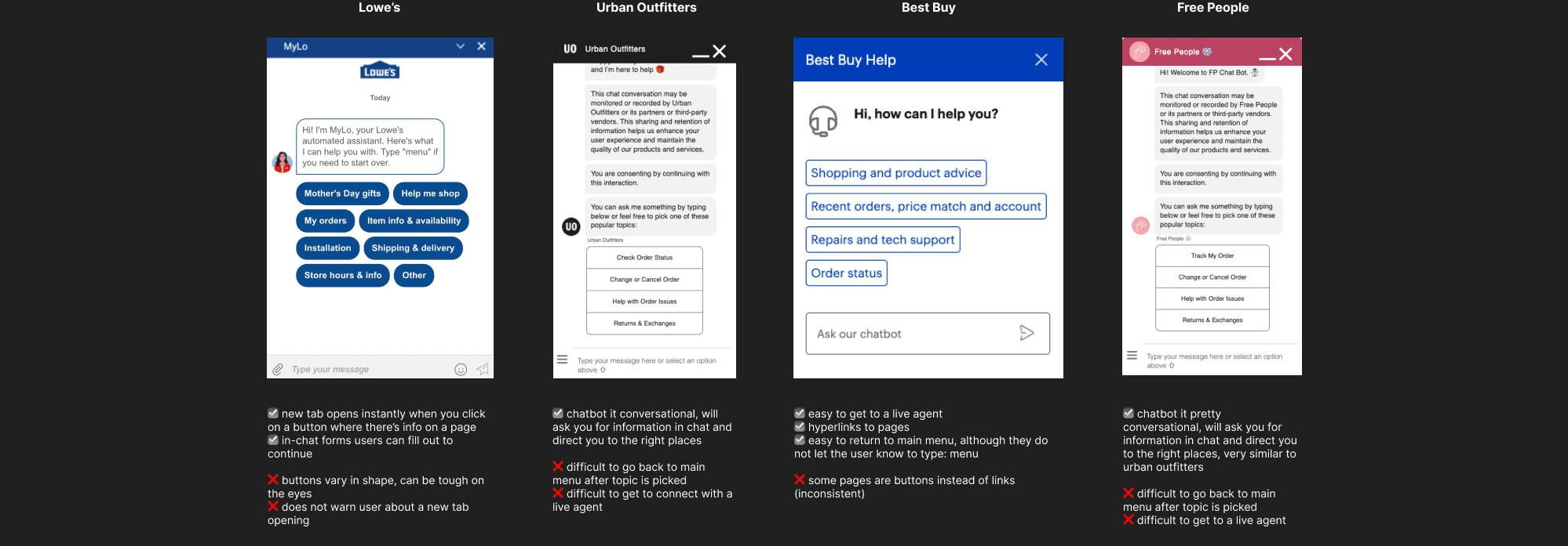



☑️ new tab opens instantly when you click on a button where there’s info on a page
+ in-chat forms users can fill out to continue
❌ buttons vary in shape, can be tough on the eyes
❌ does not warn user about a new tab opening
Lowe’s

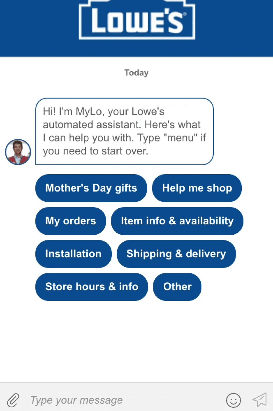
☑️ chatbot it conversational, will ask you for information in chat and direct you to the right places
❌ difficult to go back to main menu after topic is picked
❌ difficult to get to connect with a live agent
Urban Outfitters

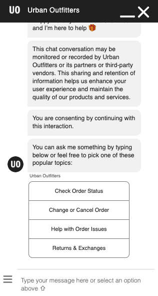
☑️ easy to get to a live agent
☑️ hyperlinks to pages
☑️ easy to return to main menu, although they do not let the user know to type: menu
❌ some pages are buttons instead of links (inconsistent)
Best Buy

Free People
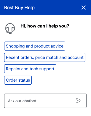
☑️ chatbot it pretty conversational, will ask you for information in chat and direct you to the right places, very similar to urban outfitters
❌ difficult to go back to main menu after topic is picked
❌ difficult to get to a live agent
Key Observations 🔑
1.
No Pre-Chat Form!
Users can effortlessly engage with the automated chatbot by clicking the chatbot icon, although the accessibility of the icon varies (e.g., some chatbots, such as those on Urban Outfitters and Free People, were more hidden).
2.
Less is More!
Noted a more streamlined approach with a minimum of four options on the initial screen for user interaction.
3.
Conversational!
Each platform maintained a conversational tone.
Key Observations 🔑
Key Observations 🔑
1.
1.
No Pre-Chat Form!
Users can effortlessly engage with the automated chatbot by clicking the chatbot icon, although the accessibility of the icon varies (e.g., some chatbots, such as those on Urban Outfitters and Free People, were more hidden).
No Pre-Chat Form!
Users can effortlessly engage with the automated chatbot by clicking the chatbot icon, although the accessibility of the icon varies (e.g., some chatbots, such as those on Urban Outfitters and Free People, were more hidden).
2.
2.
Less is More!
Noted a more streamlined approach with a minimum of four options on the initial screen for user interaction.
Less is More!
Noted a more streamlined approach with a minimum of four options on the initial screen for user interaction.
3.
3.
Conversational!
Each platform maintained a conversational tone.
Conversational!
Each platform maintained a conversational tone.
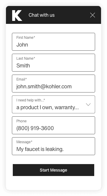
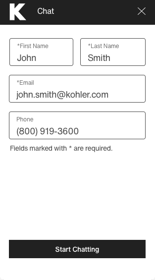
The pre-chat form allowed the Customer Service Representatives (CSRs) to create cases on Salesforce, making it easy to access prior information when users reconnected.
Streamlined existing pre-chat form, reducing it from six to four fields.
Updated "Start Message" copy to "Start Chatting" to clearly let users know they will be interacting with a chatbot or live agent.
Users can quickly connect with the automated chatbot.
v.1
v.1
v.2
v.2



V.2 Update
V.2 Update
V.2 Update
"We still need a pre-chat form" - my P.O.
"We still need a pre-chat form" - my P.O.
"We still need a pre-chat form" - my P.O.
Define 💡
Define 💡
Define 💡
~ Convos with the P.O. ~
~ Convos with the P.O. ~
~ Convos with the P.O. ~
"What should the tone be?"
"What should the tone be?"
"What should the tone be?"
"Which options should we show first?"
"Which options should we show first?"
"Which options should we show first?"
"What if they just really want to speak to a live agent?"
"What if they just really want to speak to a live agent?"
"What if they just really want to speak to a live agent?"
"How can the users return to the main menu?"
"How can the users return to the main menu?"
"How can the users return to the main menu?"
Professional and friendly!
Professional and friendly!
Professional and friendly!
To streamline the user journey, we decided not to overwhelm the first screen with too many options. Based on our research, we strategically positioned the four most common issues upfront, moving the last two behind the "Other" option. This design allows users to quickly determine if the initial four options apply to them, encouraging self-guided help. If not, a simple click on "Other" provides an efficient pathway to further assistance.
To streamline the user journey, we decided not to overwhelm the first screen with too many options. Based on our research, we strategically positioned the four most common issues upfront, moving the last two behind the "Other" option. This design allows users to quickly determine if the initial four options apply to them, encouraging self-guided help. If not, a simple click on "Other" provides an efficient pathway to further assistance.
To streamline the user journey, we decided not to overwhelm the first screen with too many options. Based on our research, we strategically positioned the four most common issues upfront, moving the last two behind the "Other" option. This design allows users to quickly determine if the initial four options apply to them, encouraging self-guided help. If not, a simple click on "Other" provides an efficient pathway to further assistance.
To align with our goal of promoting self-help, I proposed placing a 'Live Agent' option discreetly behind the 'Other' category. This encourages users to reflect on their issues before seeking immediate assistance from a live agent. It strikes a balance between self-help encouragement and live assistance accessibility for users.
To align with our goal of promoting self-help, I proposed placing a 'Live Agent' option discreetly behind the 'Other' category. This encourages users to reflect on their issues before seeking immediate assistance from a live agent. It strikes a balance between self-help encouragement and live assistance accessibility for users.
To align with our goal of promoting self-help, I proposed placing a 'Live Agent' option discreetly behind the 'Other' category. This encourages users to reflect on their issues before seeking immediate assistance from a live agent. It strikes a balance between self-help encouragement and live assistance accessibility for users.
We can simply inform users that typing 'menu' at the beginning of the chat interaction will bring up the main menu – a practice I've observed on other sites.
We can simply inform users that typing 'menu' at the beginning of the chat interaction will bring up the main menu – a practice I've observed on other sites.
We can simply inform users that typing 'menu' at the beginning of the chat interaction will bring up the main menu – a practice I've observed on other sites.
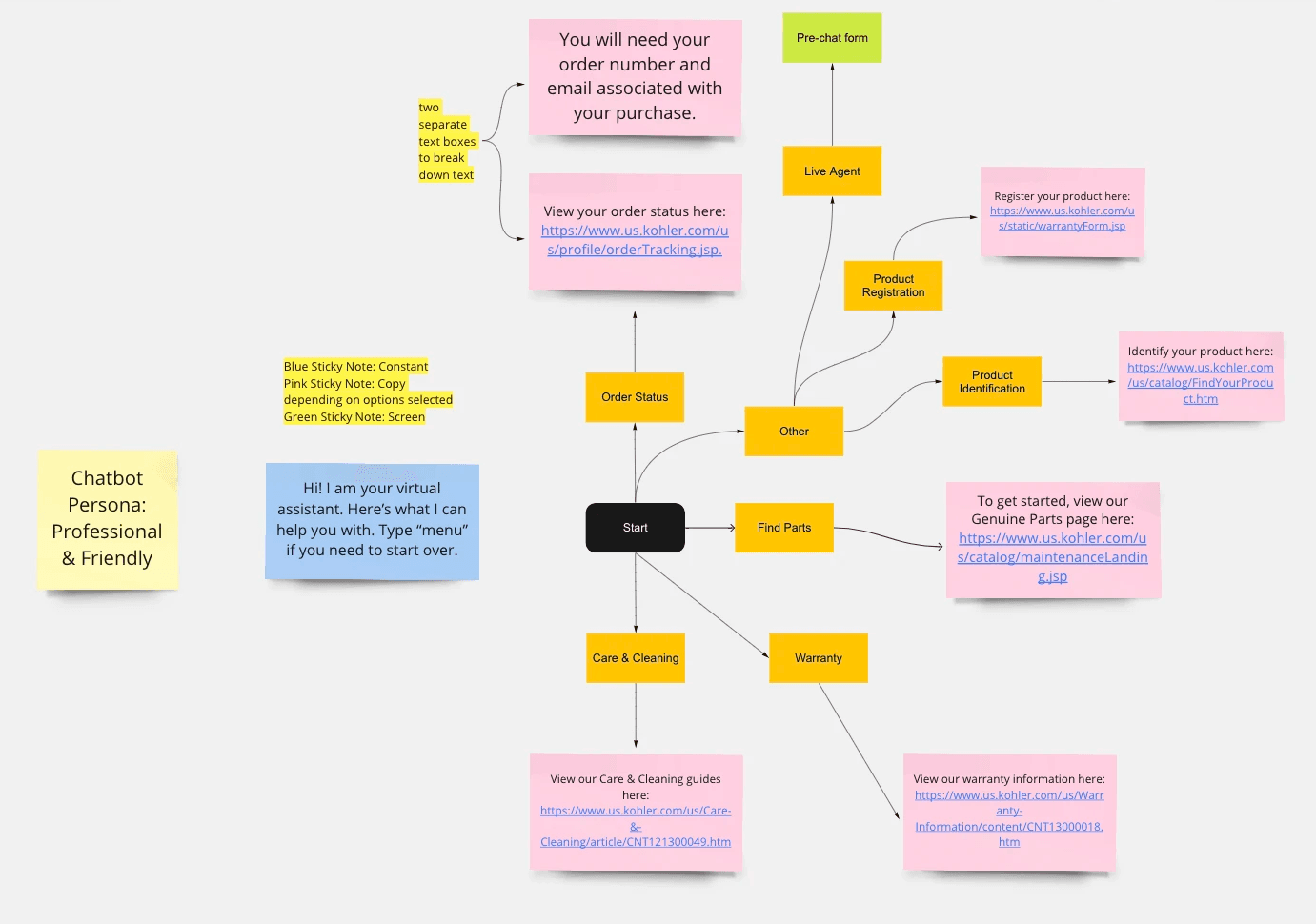
Our collaborative sessions were aimed at simplicity—ensuring users’ questions are addressed within two or three interactions at most, promoting an efficient and user-friendly experience. Here are the streamlined flows I created to address the top six user issues:
Our collaborative sessions were aimed at simplicity—ensuring users’ questions are addressed within two or three interactions at most, promoting an efficient and user-friendly experience. Here are the streamlined flows I created to address the top six user issues:
Our collaborative sessions were aimed at simplicity—ensuring users’ questions are addressed within two or three interactions at most, promoting an efficient and user-friendly experience. Here are the streamlined flows I created to address the top six user issues:
The gist of the discussions I had with my P.O. in regard to the user flows of the chatbot.
The gist of the discussions I had with my P.O. in regard to the user flows of the chatbot.
The gist of the discussions I had with my P.O. in regard to the user flows of the chatbot.


"Okay, the user has their question answered. What's next?"
"Okay, the user has their question answered. What's next?"
"Okay, the user has their question answered. What's next?"
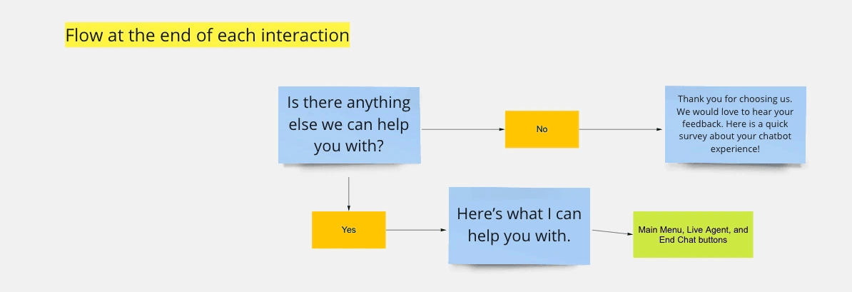
We can’t say goodbye just yet! We have to make sure the user has their question answered, or be able to assist with anything else. This is the flow I came up with after research:
We can’t say goodbye just yet! We have to make sure the user has their question answered, or be able to assist with anything else. This is the flow I came up with after research:
We can’t say goodbye just yet! We have to make sure the user has their question answered, or be able to assist with anything else. This is the flow I came up with after research:
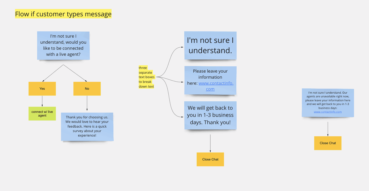
The user can quickly connect with a live agent if they start typing and if the agents are offline, they can send a message and receive a response within 1-3 business days.
The user can quickly connect with a live agent if they start typing and if the agents are offline, they can send a message and receive a response within 1-3 business days.
The user can quickly connect with a live agent if they start typing and if the agents are offline, they can send a message and receive a response within 1-3 business days.


"What if the user just starts typing or if the agents are offline?"
"What if the user just starts typing or if the agents are offline?"
"What if the user just starts typing or if the agents are offline?"
Flows if agents are offline

Flows if agents are offline

Flows if agents are offline
Design 🎨
Design 🎨
I created high-fidelity wireframes with Kohler's monochromatic color scheme, incorporating initial flows for user response testing. Collaborating with my P.O. and UX Manager, I engaged with the software team, aligning designs with Salesforce Einstein's functional requirements. Transparently sharing my design rationale, I sought their crucial feedback, which gave me the red or green light. In the face of a 'red,' I asked a few questions, primarily exploring variations of 'why won't it work?' Conversely, a 'green light' meant I could continue with the design, prompting me to send a celebration reaction 🎉.
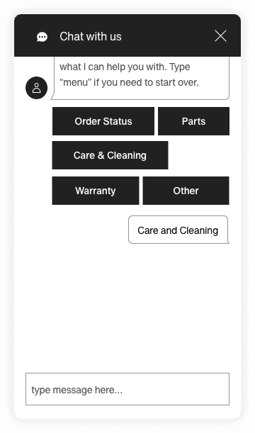
Check out the prototypes for the top four issues:
It’s time for visuals!
It’s time for visuals!
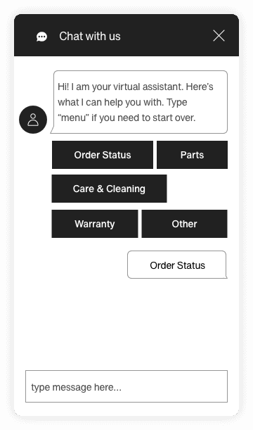


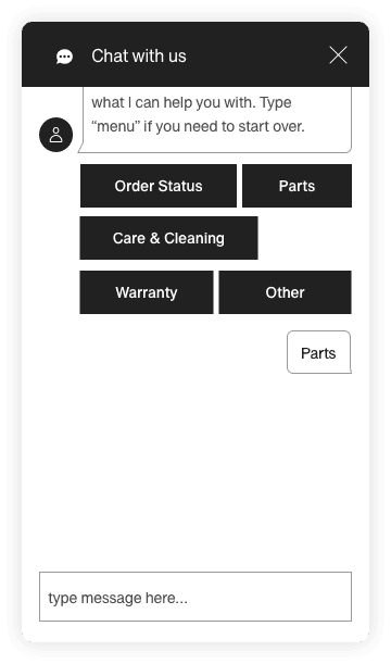

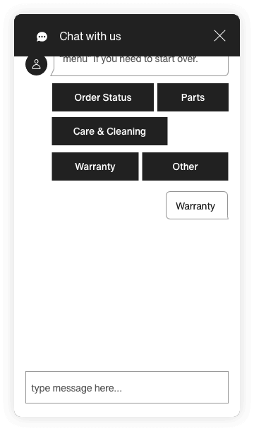



Order Status
Care & Cleaning
After prototyping, I crafted a usability transcript, presenting users with five targeted tasks to complete. This deliberate approach allowed for a comprehensive evaluation of the prototype's effectiveness in real-world scenarios, providing invaluable insights into user interaction and experience.
After prototyping, I crafted a usability transcript, presenting users with five targeted tasks to complete. This deliberate approach allowed for a comprehensive evaluation of the prototype's effectiveness in real-world scenarios, providing invaluable insights into user interaction and experience.
After prototyping, I crafted a usability transcript, presenting users with five targeted tasks to complete. This deliberate approach allowed for a comprehensive evaluation of the prototype's effectiveness in real-world scenarios, providing invaluable insights into user interaction and experience.
Results
Results
Results
Users preferred initially exploring the website for self-help.
They wanted the chatbot to be more conversational.
Tasks resulted in an overall score of 4 out of 5 in terms of task ease.
Users preferred initially exploring the website for self-help.
They wanted the chatbot to be more conversational.
Tasks resulted in an overall score of 4 out of 5 in terms of task ease.
Users preferred initially exploring the website for self-help.
They wanted the chatbot to be more conversational.
Tasks resulted in an overall score of 4 out of 5 in terms of task ease.


I created high-fidelity wireframes with Kohler's monochromatic color scheme, incorporating initial flows for user response testing. Collaborating with my P.O. and UX Manager, I engaged with the software team, aligning designs with Salesforce Einstein's functional requirements. Transparently sharing my design rationale, I sought their crucial feedback, which gave me the red or green light. In the face of a 'red,' I asked a few questions, primarily exploring variations of 'why won't it work?' Conversely, a 'green light' meant I could continue with the design, prompting me to send a celebration reaction 🎉.
Check out the prototypes for the top four issues:
Final Touches 🪄
Final Touches 🪄
Integrated a subtle privacy policy message above the initial chat bubble for transparent communication.
Integrated a subtle privacy policy message above the initial chat bubble for transparent communication.
Integrated a subtle privacy policy message above the initial chat bubble for transparent communication.
Hosted a naming contest, resulting in the chatbot being named 'Grace', to handle users' issues gracefully.
Hosted a naming contest, resulting in the chatbot being named 'Grace', to handle users' issues gracefully.
Hosted a naming contest, resulting in the chatbot being named 'Grace', to handle users' issues gracefully.
Implemented a user feedback form with a thumbs-up/down option for quick feedback.
Implemented a user feedback form with a thumbs-up/down option for quick feedback.
Implemented a user feedback form with a thumbs-up/down option for quick feedback.
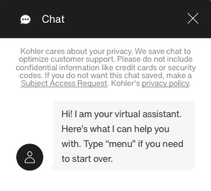

Hi! My name is Grace, your virtual assistant.
K
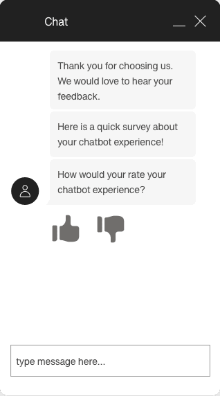


View Live Chatbot!
…. and Phase One is ready to go!
…. and Phase One is ready to go!
…. and Phase One is ready to go!
This was the first end-to-end project that I designed for a product launch in the ~real~ world! It unveiled the many considerations required to empower users to answer their own questions efficiently, equipping me with not only essential design skills but also a unique set of capabilities that I can utilize in the future.
Reflections 💭
Reflections 💭
Reflections 💭
This was the first end-to-end project that I designed for a product launch in the ~real~ world! It unveiled the many considerations required to empower users to answer their own questions efficiently, equipping me with not only essential design skills but also a unique set of capabilities that I can utilize in the future.
This was the first end-to-end project that I designed for a product launch in the ~real~ world! It unveiled the many considerations required to empower users to answer their own questions efficiently, equipping me with not only essential design skills but also a unique set of capabilities that I can utilize in the future.
Conversational Design Skills and Balancing Automation with Human Touch
Integration Challenges (and how to work with them)
Ethical Considerations
For any future user tests, I would enhance clarity in instructions by emphasizing key directives through bold formatting. Additionally, I'd aim to set a more immersive scene for participants, minimizing potential distractions from the background. This approach ensures users can focus on the tasks at hand and effortlessly locate the chatbot, contributing to a more refined and distraction-free testing environment.
For any future user tests, I would enhance clarity in instructions by emphasizing key directives through bold formatting. Additionally, I'd aim to set a more immersive scene for participants, minimizing potential distractions from the background. This approach ensures users can focus on the tasks at hand and effortlessly locate the chatbot, contributing to a more refined and distraction-free testing environment.
For any future user tests, I would enhance clarity in instructions by emphasizing key directives through bold formatting. Additionally, I'd aim to set a more immersive scene for participants, minimizing potential distractions from the background. This approach ensures users can focus on the tasks at hand and effortlessly locate the chatbot, contributing to a more refined and distraction-free testing environment.
Thank you to my product team for their collaborative spirit throughout my first end-to-end project! Together, we brought this to life and you can now check out the live version at kohler.com 😊
Thank you to my product team for their collaborative spirit throughout my first end-to-end project! Together, we brought this to life and you can now check out the live version at kohler.com 😊
Thank you to my product team for their collaborative spirit throughout my first end-to-end project! Together, we brought this to life and you can now check out the live version at kohler.com 😊
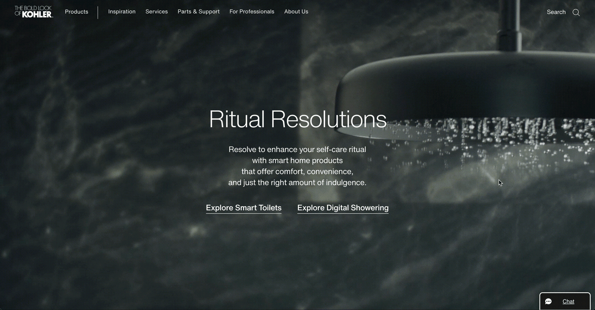

Grace is at the bottom right of the site! ↑
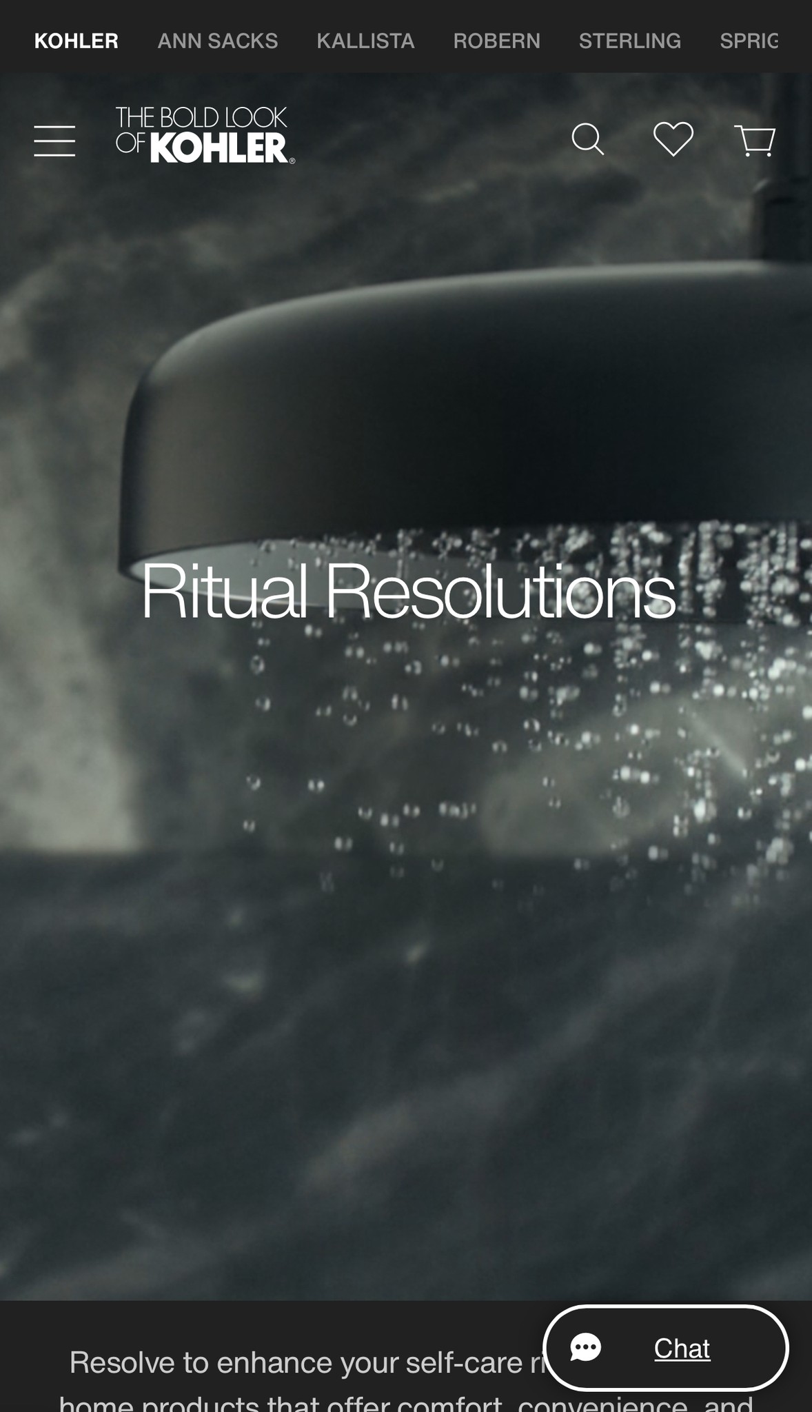

Grace is at the
bottom right of the site!

Grace is at the bottom right of the site! ↑
